Form templates (DNN)
Don't start from a blank canvas. The Template Gallery ships ready-made forms — from a 4-field contact form to a 27-field patient intake — and any MegaForm JSON export can be imported as a starting point.
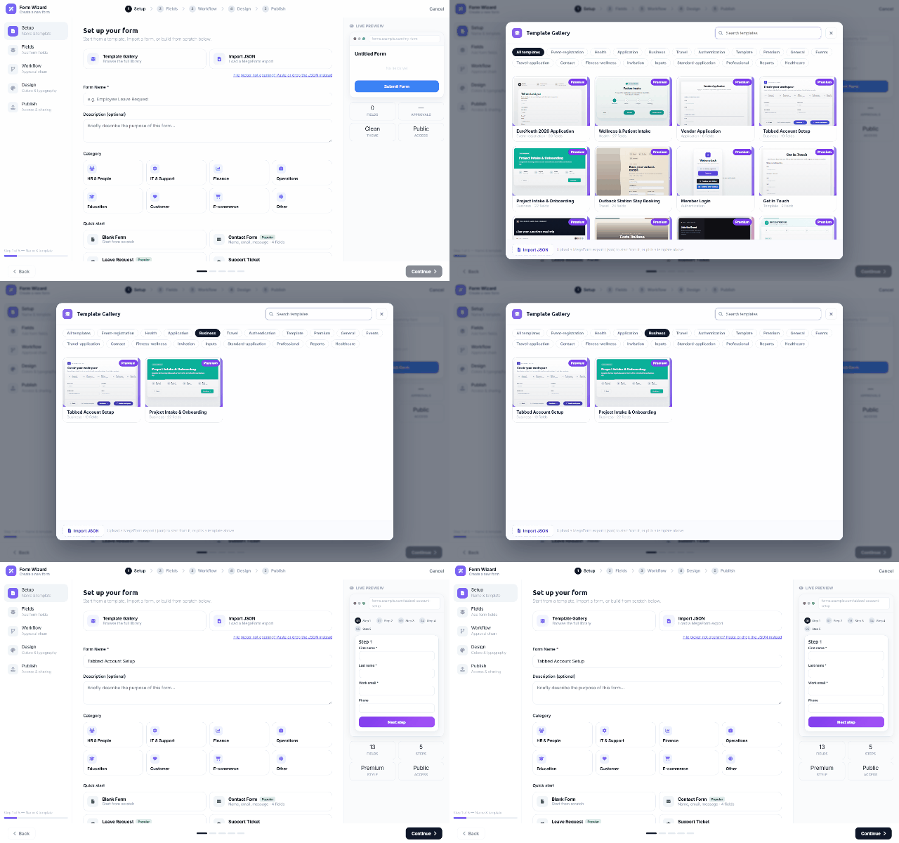
Where it lives
The gallery opens from the Form Wizard's Setup step (Template Gallery — browse the full library), with quick picks right on the step: Blank Form, Contact Form, Leave Request, Support Ticket, Feedback Survey — plus the premium set (EuroYouth application, Wellness & Patient Intake, Vendor Application, Tabbed Account Setup, Project Intake & Onboarding, …).
Using it
- Filter by category chips — Event-registration, Health, Application, Business, Travel, Authentication, Contact, Reports, Healthcare… — or search by name.
- Pick a card and the wizard continues with that template's fields, layout, theme and (where the template carries one) its workflow — everything stays editable in the builder afterwards.
- Import JSON — upload (or paste) a MegaForm export. Exports are cross-platform: a form exported from an Oqtane site imports on DNN unchanged, which is also the practical way to move forms between environments.
Templates are starting points, not locks — after import the form is yours: rename it, add fields, restyle it, attach a different workflow.
Premium skins: one form, several different faces
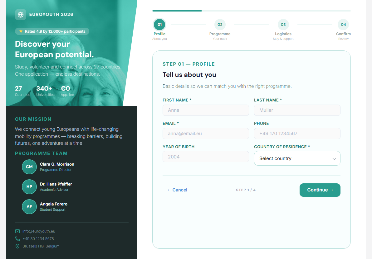
Several templates in the gallery are premium skins — a magazine-style layout wrapped around the form, with a photographic hero pane on the left and the wizard on the right. The EuroYouth application ships in four such skins that share exactly the same 16 fields and the same four steps, so you can change the look without changing the data you collect.
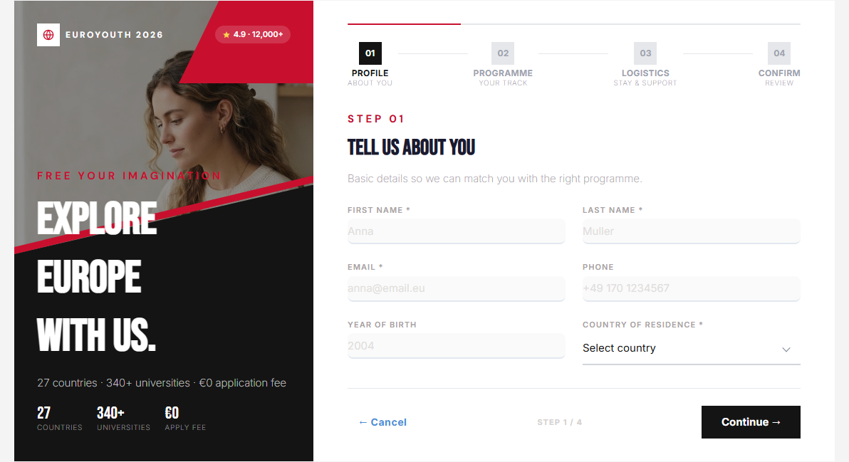
EuroYouth — Brochure
Editorial crimson-and-black treatment: a diagonal photo collage, condensed display type and underlined inputs.
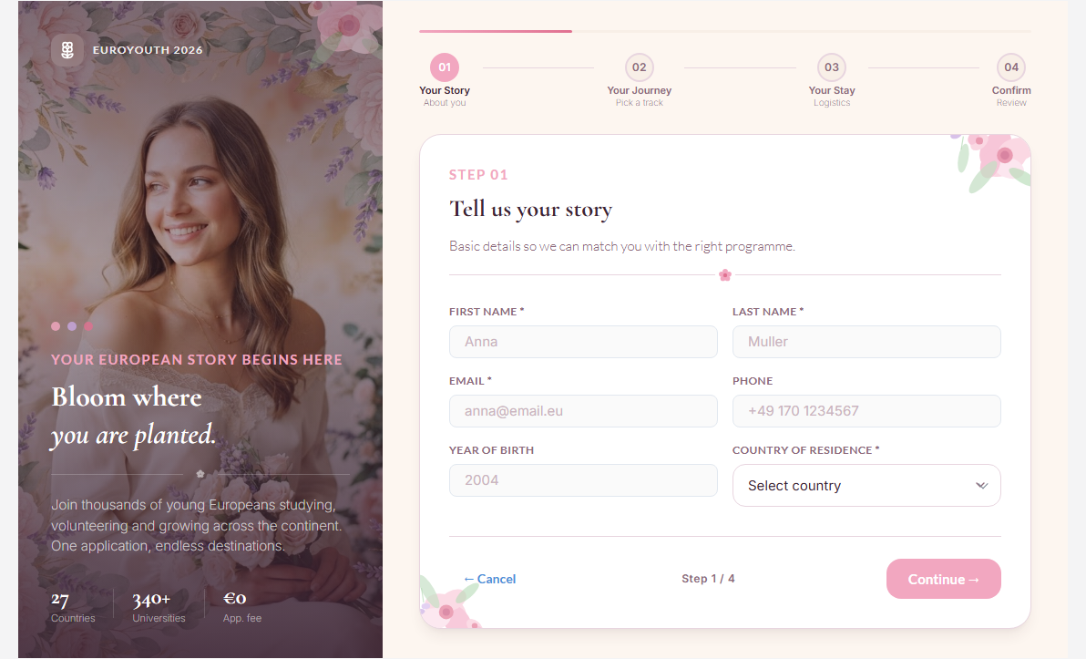
EuroYouth — Floral
Soft botanical variant: watercolour florals, an italic Cormorant Garamond headline and rounded blush cards.
EuroYouth — Teal Brochure
Institutional teal layout that adds a mission statement and a programme-team block beneath the hero — useful when the form doubles as a landing page.
Working with premium skins
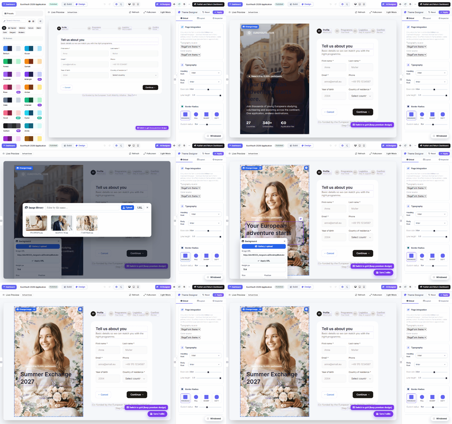
- The hero is desktop-only. The hero pane appears from 1024 px upward. In the builder's Design tab the live preview sits between the Presets and Theme Designer rails, so it can drop below that width — in which case the hero is hidden by design. Collapse one rail, switch the preview to desktop, or open Fullscreen to see (and edit) it.
- Swap the hero image and hero text in the builder. With the hero visible, hover it in the Design preview and use Change image; click a headline, kicker or stat to edit it inline. Both are written back into the form.
- Keep the layout, change the words. The skin's CSS lives in the template, so editing content never rewrites it — a reworded form stays pixel-consistent with the original design.
The full round-trip — collapse the Presets rail so the hero renders, pick a new hero image from the library, retype the headline inline, then Save — looks like this: